Overview
Introduction
Well-designed visuals make indicators and strategies easier to use and less cluttered. Each visual element presents data differently:
- Plot visuals include all
plot*()functions, horizontal levels, background and bar coloring, and fills. - Drawing visuals include lines, polylines, linefills, boxes, labels, and tables.
Scripts can configure where and how the visual elements appear by using the script-wide visual settings.
By understanding when to use each tool effectively, programmers can pick the best visual for the task to make the most of the power of Pine Script®.
This page describes plots and drawings, and what their differences are. It includes all the available visual constructs and examples of their use in built-in indicators (for more details about a specific visual element, refer to its User Manual page).
Script-wide visual settings
Some visual settings control how all of the script’s outputs collectively appear on the chart, regardless of their individual properties. These script-wide visual settings are parameters in the indicator() or strategy() declaration statement.
overlay
The overlay parameter controls whether the script’s outputs appear in the main pane or a separate pane. By default, its value is false, so adding a script to the chart displays its visual outputs in a separate pane to the main chart series.
Whereas the overlay parameter affects the script as a whole, the force_overlay parameter controls the pane location for individual elements. Using force_overlay = true displays the specified element in the main pane, even if the script’s overlay argument is false. This allows a script occupying a separate pane to overlay only some visuals on the main chart. The force_overlay parameter is available for all plot*() functions, bgcolor(), and all drawing *.new() constructor functions (box.new(), label.new(), etc.).
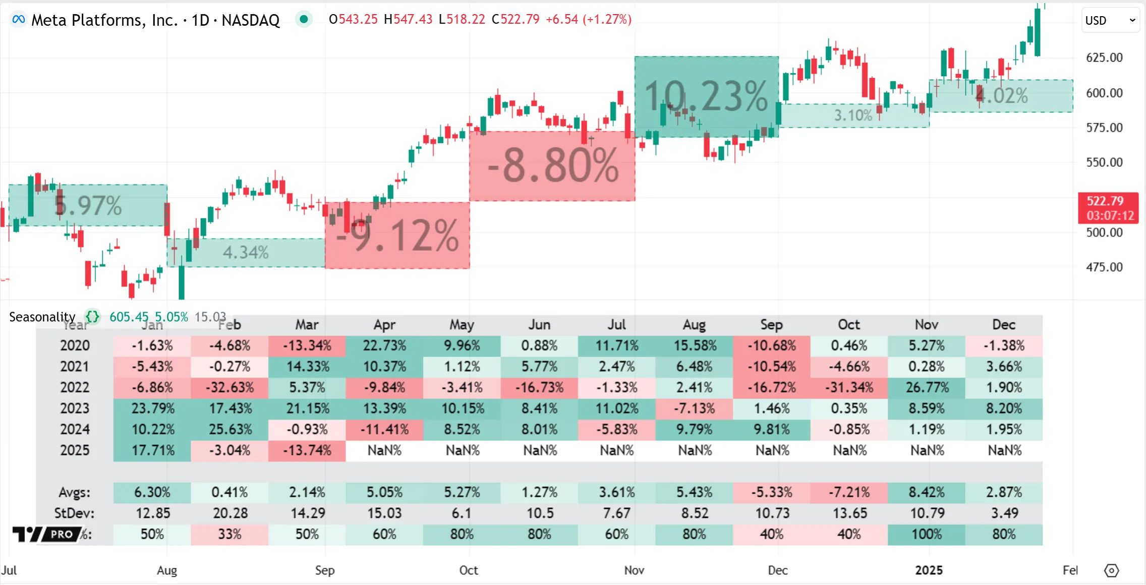
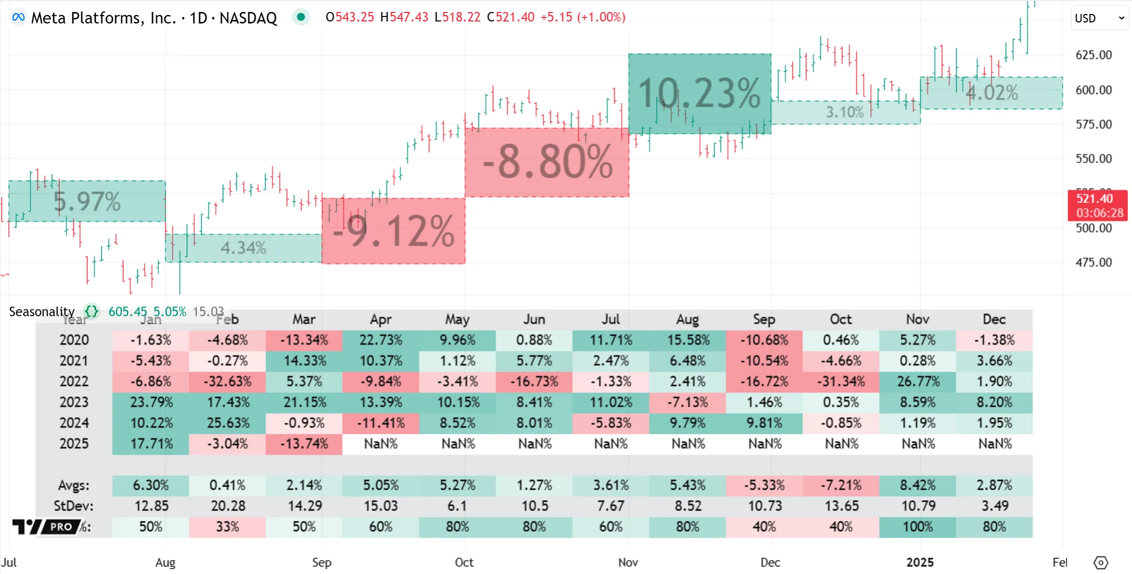
For example, the built-in Seasonality indicator uses overlay = false to display in a separate pane, where it displays its primary visual of a table, but draws boxes on the main chart with force_overlay = true:
scale
A script’s scale parameter specifies the y-axis scale that its pane visuals use. By default, scripts overlayed in the main pane use the existing chart scale (scale.none). Specifying a scale.right or scale.left argument in overlayed scripts generates a new scale distinct from the main chart’s price scale. Scripts displaying in a separate pane generate their own scale by default, which they can also set to the left or right position. For instance, this image shows an overlayed indicator using a distinct right-side scale, and a separate pane indicator using a left-side scale:
behind_chart
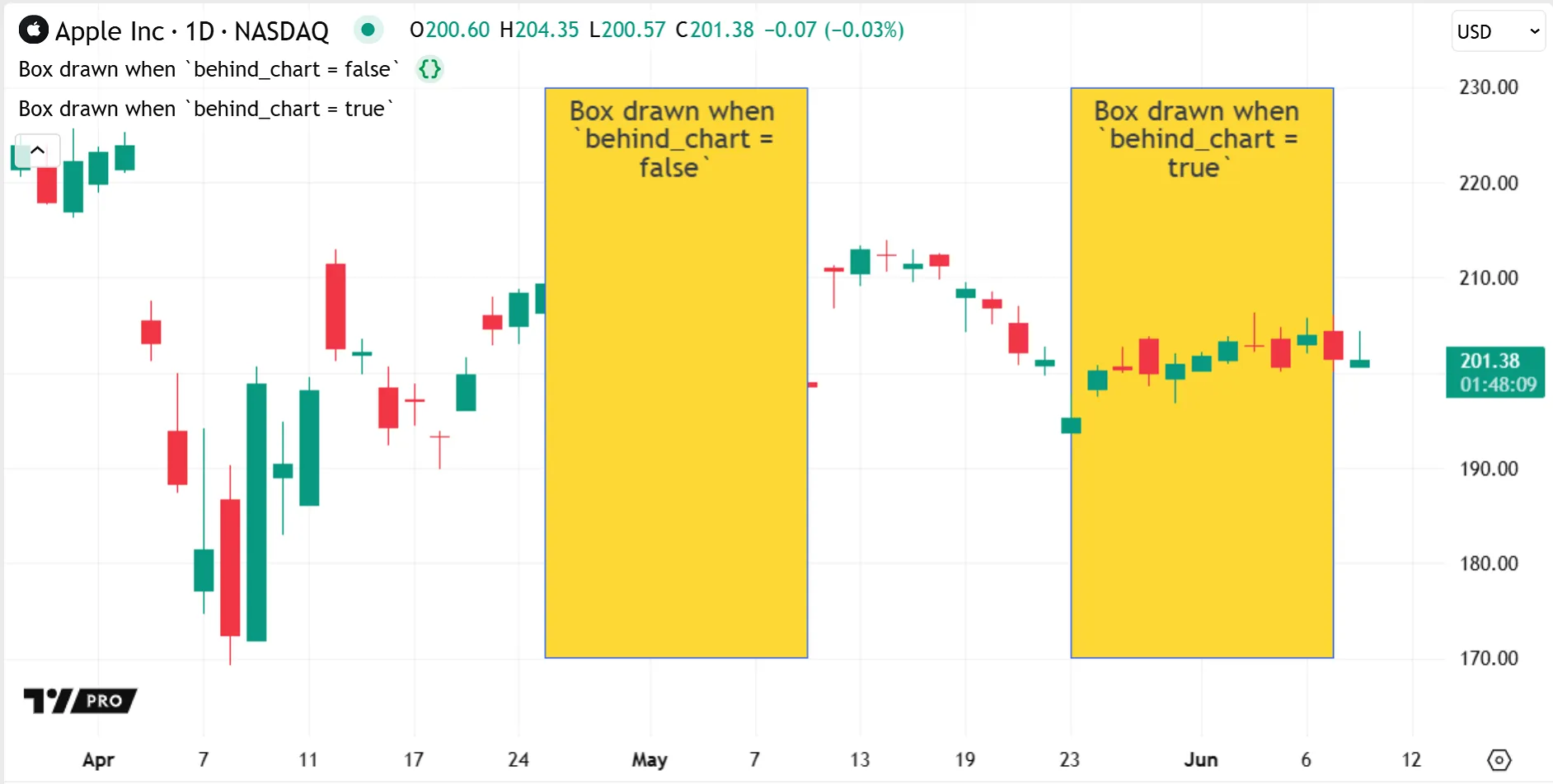
The behind_chart parameter specifies whether a script’s visuals appear behind or in front of the main chart series. By default, its value is true, so visuals overlayed in the main pane appear behind the chart bars. When behind_chart is false, visuals appear in front of the bars, which may obscure bars, depending on the type of visual and its color transparency:
Changing settings
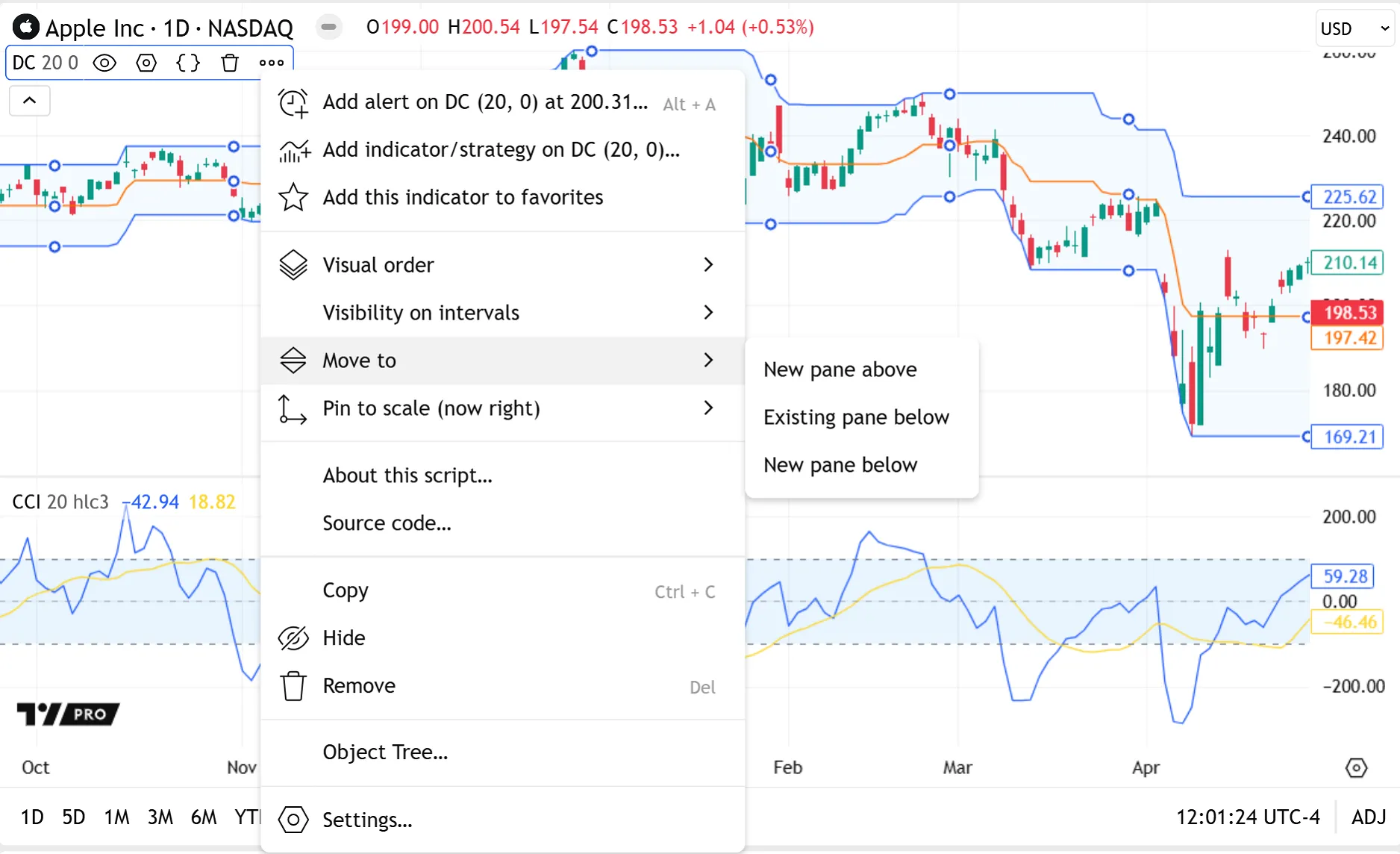
To adjust the visual settings of a script on the chart, click the “More” menu (three dots icon) in the script’s status line. Options are available to adjust the script’s visual order, move it to another pane, and change its y-axis scale:
Plot visuals
The outputs of the following functions are classified as plot visuals:
- All
plot*()functions:- Data series plots using plot()
- Shape plots using plotshape()
- Character plots using plotchar()
- Arrow plots using plotarrow()
- Bar plots using plotbar()
- Candle plots using plotcandle()
- Bar coloring using barcolor()
- Background coloring using bgcolor()
- Horizontal levels using hline()
- Fills for plots and horizontal levels using fill()
Plots are serial visuals that always return a result on each bar — although the result can be na. One plot therefore forms a series. By contrast, drawing visuals instantiate individual objects. A single plot visual function call can display results on all the bars in the main series, no matter how many bars display in the series, while drawings adhere to a drawing limit of approximately ~500 objects.
A script creates plot visuals sequentially as it executes across the chart bars, so it cannot draw them into the past or future all at once like drawings. For example, plot(close) plots the current close on the current bar. Pine’s execution model then repeats this for every bar in the dataset.
Scripts create plots with offsets in exactly the same way. They appear to end at past or future bars because the script executes the same plot call on each bar and simply displays each result the same fixed number of bars forwards or backwards.
Display in other locations
Plots can display results in locations other than the chart pane, unlike drawings. The last numeric value of a plot can display in the price scale. The script’s status line and the Data Window can display plot values for specific bars, and the values update as the user hovers over different bars:
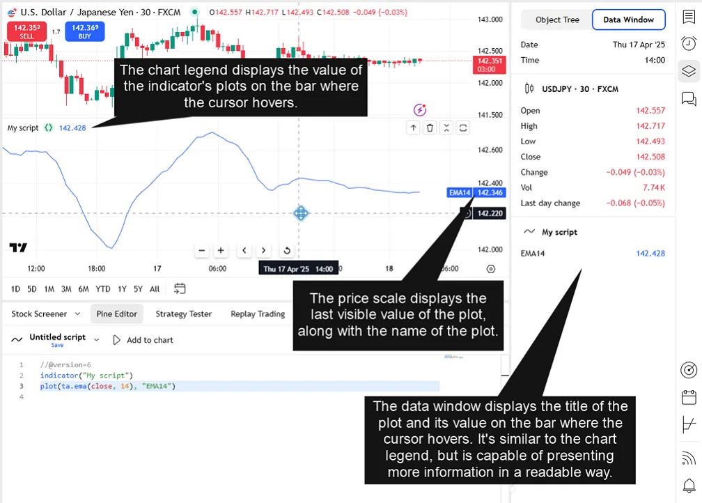
In one script, plots can display their results in different places by using different arguments for the display parameter for each plot function. For example, a script can display one plot’s results in all locations, display another plot everywhere but the status line, and create a third plot with no visible display.
The plot*() functions accept multiple display.* arguments and support addition and subtraction to combine arguments for further customization. Other, numerically simpler plot visuals like horizontal levels, fills, and coloring functions have only two display states: they either display a pane visual (display.all) or are hidden (display.none).
This simple demonstration script uses various plot visuals and display locations to plot the open and close prices, plot the difference between them (barCO), and to signal when that difference is greater than 5:
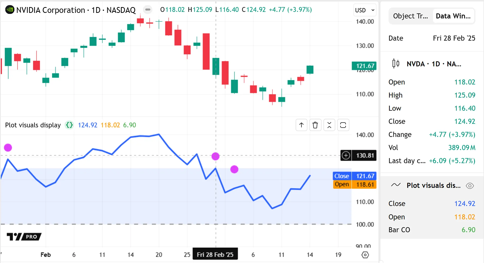
Note that:
- Although there are no arrows visible in the script pane, the plotarrow() call still calculates and plots the
barCOvalues on every bar, as indicated by the “Bar CO” result in the Data Window and the matching green result in the status line. - Since
plotshape(barCO > 5)uses a “bool” series, the plot’s numeric results can only be 1 or 0 on any bar. We set it to display only in the chart pane because that’s our most useful visual signal for this plot. Being selective with display options can help to keep results in any one location free from clutter.
The format and precision parameters of plot*() functions can further customize how numeric results appear in the status line, price scale, and Data Window. The format parameter specifies whether to format plot values as prices, percentages, or volume. The precision parameter specifies the number of decimal digits that plot values include for non-volume formats. See the `plot()` parameters section of the Plots page to learn more.
Additionally, users can manage whether numeric plot results are visible for a given indicator or chart by using settings at both the indicator and chart level, without editing any source code (see the Help Center article on how to hide values of indicators for more). An indicator’s settings control whether any plot values appear in that indicator’s status line and price scale. A chart’s settings control whether status line and price scale values appear at all in any indicators on that chart. Disabling the indicator settings overrides the script’s per-plot display properties, while the chart settings override both.
Users can also customize the visibility, color, and style of plot visuals without needing to create new inputs or edit the script. Settings are automatically generated in the indicator’s “Style” tab for every plot visual in the script, regardless of their display state:
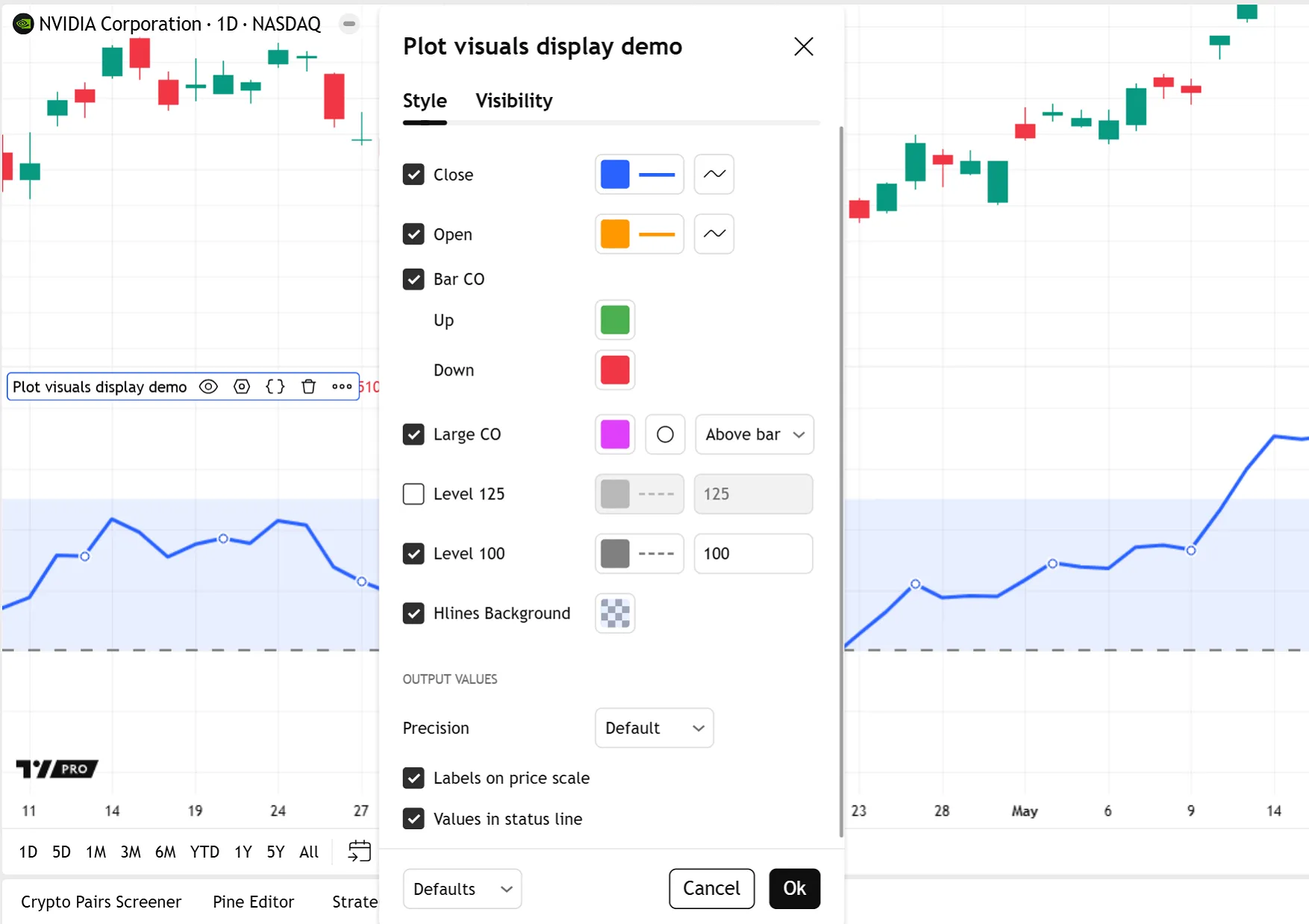
Note that if the script generates any dynamic colors, the color pickers in the “Style” settings do not display. See the Maintaining automatic color selectors section of the Colors page to learn more.
The display.* arguments represent the default state of the script’s plot visuals. Disabling a plot from the indicator’s “Style” settings and then reactivating it causes the plot to revert to display.all, unless the indicator is reset to its default settings.
The ability to display outputs in several locations and to visually track a series across the chart bars makes plot visuals useful debugging tools. See the Plots and chart colors section of the Debugging page for more information.
External uses: exports, alerts, and more
Unlike drawings, plots have uses outside the script: exporting data, creating alerts, setting another indicator’s source input, and scanning watchlists using the Pine Screener.
These uses for plot results function regardless of a plot’s display.* state on the chart and do not require special code for the outputs. Indeed, when creating plots for use in alerts or data exports, using display.none can keep a script’s visuals clutter-free and avoid distorting the chart scale.
Users can export plots using the “Export chart data” feature, which generates a comma-separated values (CSV) file of the chart data (see the section on exporting indicator data to a file in the Indicators FAQ page). The exported data includes the symbol’s OHLC (open, high, low, and close) values and any numeric plot results generated by active scripts on the chart, including those displayed only in the Data Window or status line. Drawings and hidden scripts are excluded from exports.
An alert can use any plot*() call executing on the chart as its trigger condition. Users can create alerts based on plots even if the script does not include any alert-specific code such as alert() or alertcondition(). See the Help Center article on how to create alerts from the user interface. Users can also include the dynamic results from up to 20 plot*() series in an alert’s message using placeholders, as explained in the Help Center article on using variable values in alerts.
A script can use plots that are output by other indicators on the chart as a source input. The input.source() function creates a “Source” dropdown in the script’s “Inputs” settings, from which users can then select any plots displayed on the chart as the input source. Any calculated plots can act as source inputs even if they are hidden from the current chart display (e.g., the unseen plotarrow(barCO) plot from the example in the display in other locations section above, or any hidden indicators). Using a source input links both scripts, so changes to the original plot subsequently alter the input plot, and removing the source indicator from the chart removes the dependent script.
The Pine Screener uses an indicator’s plots to scan a watchlist of symbols. It generates columns showing the results of the indicator’s plot() and alertcondition() calls for each symbol. Users can also choose to filter screener results based on plot conditions. See this Help Center article on the Pine Screener to learn more.
Limitations
Scripts can plot visuals only in the global scope. Unlike drawings, plots cannot be included in the local scopes of loops, conditional structures, or user-defined functions and methods, and plot calls can only accept variables and literals that are declared globally. However, a script can still create visuals that plot conditionally by using na values for a plot’s series or color arguments, thus hiding the plot on certain bars.
While plot visuals are well suited for displaying dynamically-calculated series, those that support text, like plotshape() and plotchar(), cannot display dynamic text. The parameters of these functions accept “const string” arguments, so the same text displays on all the bars, and it cannot change during execution or be an input value, unlike the text supported in drawing visuals.
Plots can be offset into the past or future, but only by a fixed number of bars. This makes plotted shapes, for example, suitable for marking Williams fractals, which confirm after a known number of bars, but unsuitable for marking more complex types of events that confirm after an arbitrary number of bars.
Each script instance can create a maximum of 64 plots. Depending on the complexity of the plot and its arguments, one function call can count more than once towards the plot count limit. See the plot limits section of the Limitations page for more information.
Drawing visuals
Pine drawings display in a script’s pane, and provide the flexibility to represent graphical data beyond plotting series. The following elements are classified as drawing visuals:
Drawings are objects, unlike plots, which are serial visuals, so calling a drawing function does not create a visual that always returns a persistent result on every bar in the dataset. Instead, a drawing function references one instance of a drawing object, which can be at an arbitrary location relative to the bar on which the script called the function.
Since drawings are not serialized, scripts can call the same drawing function several times on one bar to create multiple drawings at different locations on the chart at once.
Each drawing visual has its own namespace with built-in functions for creating and managing the drawing objects. Most drawing parameters accept “series” types, which allows the visuals to use dynamic positions, colors, styles, etc. Drawing parameters support input values and complex expressions as arguments, and can update these arguments as the script executes from bar to bar. Drawings like labels, boxes, and tables can also display dynamic text.
Scripts can create and manage drawing visuals from local scopes, so programmers can include drawing calls in conditional structures, loops, and user-defined functions or methods, unlike plot calls. While scripts can call drawing functions globally, it’s rarely necessary to execute drawings on every bar. Further, because scripts that create drawing objects on each bar are likely to reach the limit for that drawing type, it’s more usual to create drawings in local scopes.
The ability of drawing functions to display dynamic data at any available chart location and to run in local scopes makes them useful debugging tools. See the Pine drawings section of the Debugging page for more information.
Display and customization
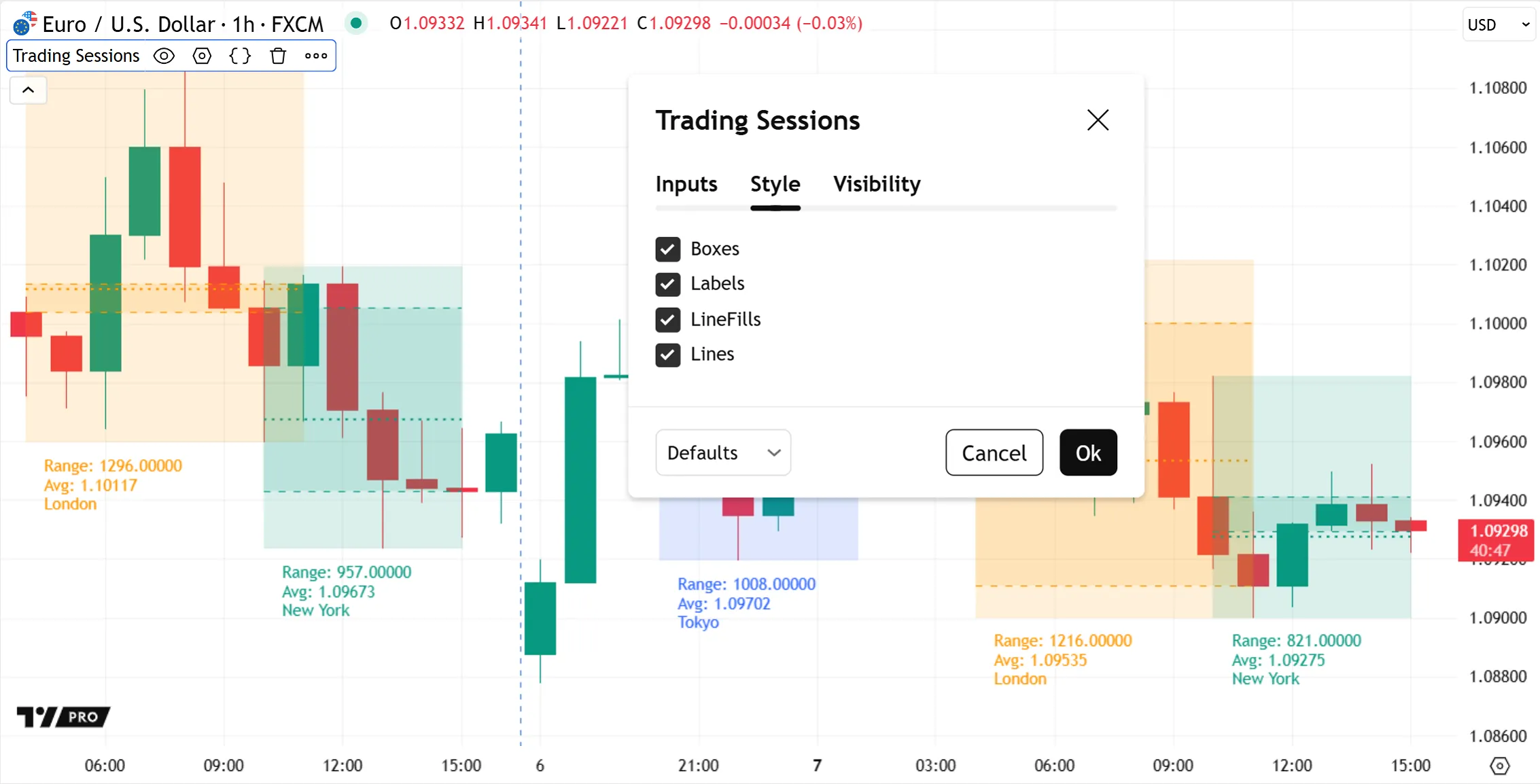
Unlike plots, drawings do not display in other locations — they display a visual only in the chart pane. Therefore, they cannot show any numeric results in the script’s status line, price scale, or Data Window, or by hovering over the drawing. Likewise, using drawings in a script does not automatically generate color/style customization options in the indicator’s “Style” tab.
Instead, the “Style” settings generate a checkbox for each drawing type used by a script, which toggles the visibility of all objects of that type in that indicator:
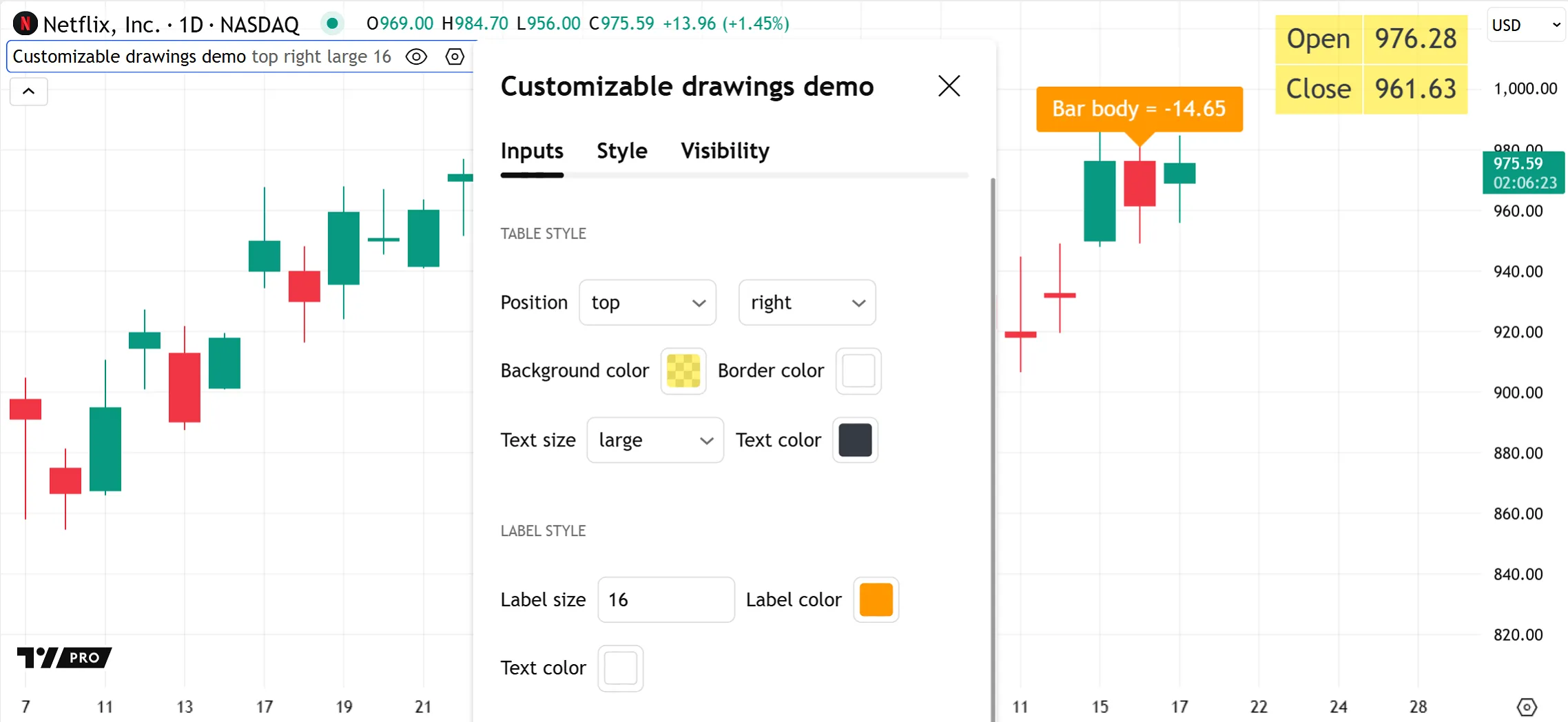
However, since drawings accept “series” arguments, scripts can use inputs to create fully customizable drawing visuals. For example, this script uses string inputs, color inputs, and integer inputs to allow users to easily customize the appearance of the table and label visuals from the indicator’s “Inputs” tab:
Limitations
There are limits to the total number of drawing visuals a script can display on the chart. A single script instance can draw a maximum of approximately 500 lines, boxes, and labels, and a maximum of 100 polylines. If the number of drawings exceeds the limit, a garbage collection mechanism deletes the oldest drawings to keep only the most recent visuals on the chart.
The max_lines_count, max_boxes_count, max_labels_count, and max_polylines_count parameters in the indicator() or strategy() declaration statement control the total number of drawings the script can display for each object type. The default value for each max_*_count parameter is 50, so if a script does not specify this parameter, it displays the 50 most recent drawings of each type.
Most drawing types have x and y coordinates, so drawing objects move as the user scrolls the chart or zooms in or out. The only exception is tables, which are anchored to one of nine fixed positions in the pane itself. See the Tables section below for more details about their unique characteristics.
The leftmost (earliest) x coordinate of a drawing object can be no more than approximately 9999 bars before or 500 bars after the bar on which the script draws it. See this entry in the Techniques FAQ to learn how to work around this issue.
Unlike plots, Pine drawings do not have external uses like creating alerts or exporting data.
Z-index
All visual elements on the chart occupy a position along the z-axis, meaning that some elements appear on top of others. The z-index is a value that represents the relative position of elements on the z-axis. Elements with a higher z-index appear on top of elements with a lower z-index.
Pine elements are divided into z-index groups based on their visual type. Each group has its own position in the z-space, and within the same group, elements created last in the script’s logic appear on top of other elements from the same group.
This list orders the visual element groups by ascending z-index, i.e., background colors are always at the bottom of z-space, and tables always appear on top of all other elements:
- Background colors
- Fills
- Plots
- Horizontal levels
- Linefills
- Lines
- Boxes
- Labels
- Tables
An element cannot be placed outside the region of z-space that its group occupies — for example, a plot can never appear on top of a table, because tables have the highest z-index.
The sole exception to this rule is that programmers can choose to arrange plot*(), hline(), and fill() visuals (and only these types of visuals) in z-space in the order in which they appear in the script, by using explicit_plot_zorder = true in indicator() or strategy() declaration statements.
When to use
Knowing the strengths of each type of visual element, and how they compare to each other, helps programmers develop efficient scripts that look good. The sections below describe some useful features of each visual element and spotlight a few built-in use cases. For more details about a specific visual element, refer to its User Manual page.
plot()
The plot() function displays a data series across the chart. A single plot() visual registers one value for every bar in the main series.
Unlike line and polyline drawings, which connect two or more chart points independent of the bar series, each data point in a plot() series relates to a specific chart bar, and only one point can exist per bar within the same plot series. Plotted “int” and “float” series can represent a variety of constant values, inputs, built-in series like close, and dynamically-calculated results like ta.sma().
The function offers multiple plot styles, including lines, step lines, histograms, areas, crosses, and circles (see the `plot()` parameters section of the Plots page for all available style options). Like other plot visuals, plot() outputs can display numeric results in locations other than the main chart pane, such as the status line, price scale, and Data Window.
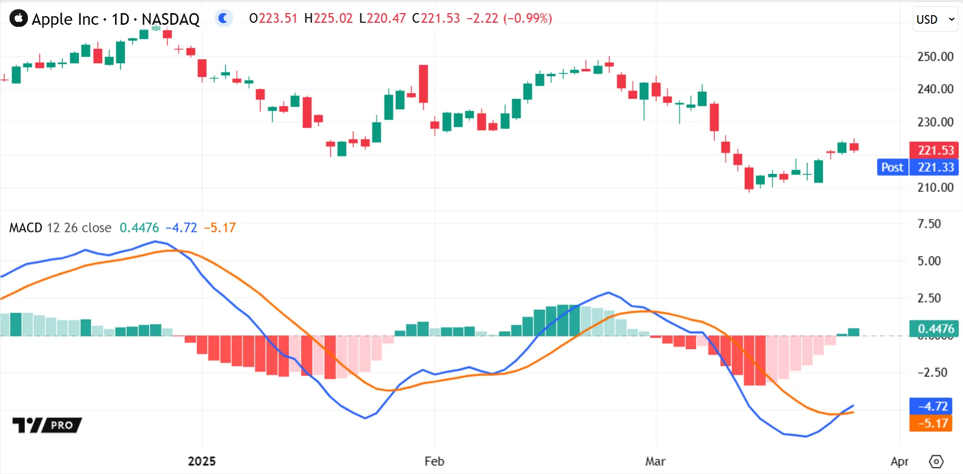
Most built-in indicators generate plots in their outputs, e.g., RSI, EMA, and Bollinger Bands. Indicators can use several plot styles in the same script to display different kinds of data simultaneously, like the MACD indicator does with its line and histogram plots:
Scripts can also use plot() to create horizontal levels in cases where the dedicated hline() function is not suitable, for example, to display a dynamically-calculated level, or to create a fill between a horizontal line and a fluctuating series.
Unlike `plotshape()` and `plotchar()`, the plot() function cannot display text and doesn’t support “bool” series. However, it can create conditional plots by setting the plot’s series values or colors to na on certain bars.
plotshape() and plotchar()
The plotshape() and plotchar() functions plot a series across the chart, like plot(), but using a wide range of shapes and characters.
The plotshape() function displays specific shape.* styles like crosses, circles, and triangles, while plotchar() displays any single alphanumeric or symbol Unicode character. See the table in the `plotshape()` section of the Text and shapes page for all available shape.* styles.
Like other plot visuals, these plots are connected to the main series. They produce one plot value per bar, which can also appear in the status line and Data Window. Both functions accept “int” and “float” series, like plot(), and additionally support “bool” series to display conditional plots.
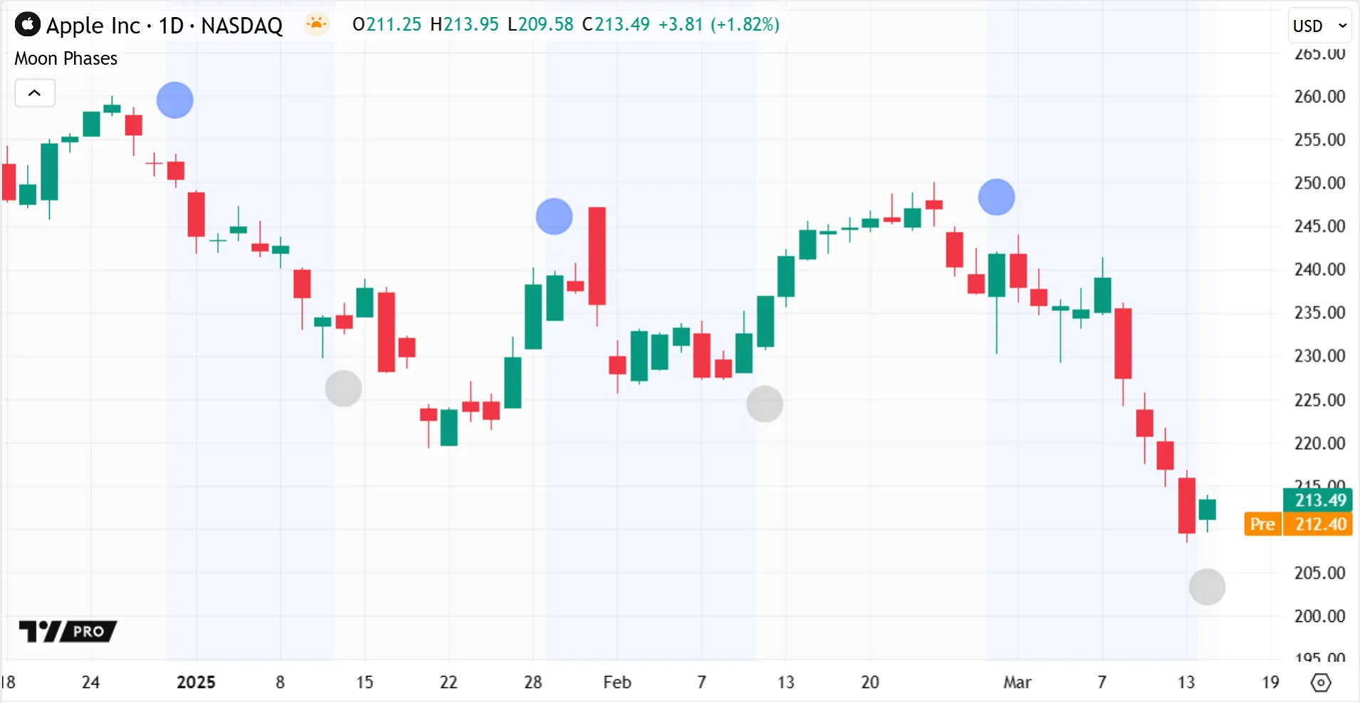
For instance, the built-in Moon phases indicator uses plotshape() to conditionally draw circles above or below the chart bars, which represent when a new or full moon occurs:
Both plotshape() and plotchar() have several location options, which can use either relative or absolute chart positions:
- They can plot graphics at absolute price positions, corresponding to each
seriesvalue. - They can position graphics near each bar in the main series, either above or below the bars.
- They can anchor graphics to the pane itself, either at the top or bottom of the pane.
The Moon Phases indicator above uses location.abovebar and location.belowbar arguments to position the circle plots near each bar at an automatic, consistent distance, regardless of the bar’s price fluctuation or the plotshape() series value.
Relative positioning also makes plotchar() and plotshape() useful for debugging numeric values or conditions. These functions can plot series values at a different scale than the chart bars without interfering with the chart scale, unlike plot() series. Hovering over a bar can verify its numeric series value in the status line or Data Window — these locations show 0 as the numeric result if there is no visual marker on this particular bar. The functions do not display a visual marker when the series value is false or na, and they also hide the marker for a 0 value in “int”/“float” series when using relative positioning.
For example, suppose we have a script overlayed in the main pane, and part of its logic generates an “int” series of 0 or 1 values based on some testCondition. Using plotchar() with a relative location argument quickly verifies that the condition occurs where expected as the function plots a visual marker only when the series value is 1. Otherwise, plotting with the absolute series locations would distort the main price scale to accommodate a marker appearing on every bar at the low price levels 0.00 and 1.00:
The plotshape() and plotchar() functions can also display text alongside their shapes. Unlike for labels, the string must be of type “const”, so the value cannot be dynamic and cannot represent series: the same text appears for all the points in the plot.
plotarrow()
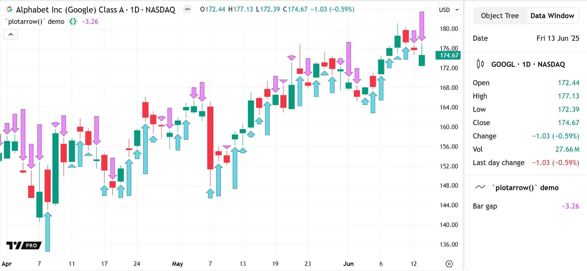
Similar to `plotshape()` and `plotchar()`, the plotarrow() function plots a series across the chart that presents graphic information using an arrow shape.
A single plotarrow() call plots an arrow on every bar, setting each arrow’s direction, position, and length based on the bar’s value in the plot series. Like other plot visuals, an arrow’s numeric value can also display in the script’s status line and Data Window.
The plotarrow() function is useful for visualizing changes in the directionality and magnitude of “int” or “float” series values across the chart. The underlying series can be at a different scale than the chart bars without visually distorting the main chart scale.
Unlike plotchar() or plotshape(), the plotarrow() function cannot display text and doesn’t accept “bool” series. However, the function can still achieve a conditional arrow plot by using na values for its series on certain bars.
This simple example indicator uses plotarrow() to visualize a barGap series, where each arrow represents the price difference between the current bar’s open and the previous bar’s close. The function call automatically sets the locations of all the arrows, plotting positive-value arrows below bars and negative-value arrows above bars, and adjusts their lengths relative to the other values in the barGap series:
plotbar() and plotcandle()
The plotbar() and plotcandle() functions create custom bar or candle sets on the chart. One call to either function registers four values — the bar or candle’s open, high, low, and close values — on every bar of the main chart series. As a result, a single plotbar() or plotcandle() call generates at least four plots counting towards a script’s total plot limit.
Indicators can use these functions to plot a new series separate from the main series, or to build new visuals for the main series itself, like the built-in Bollinger Bars indicator does to create candles with thicker wicks:
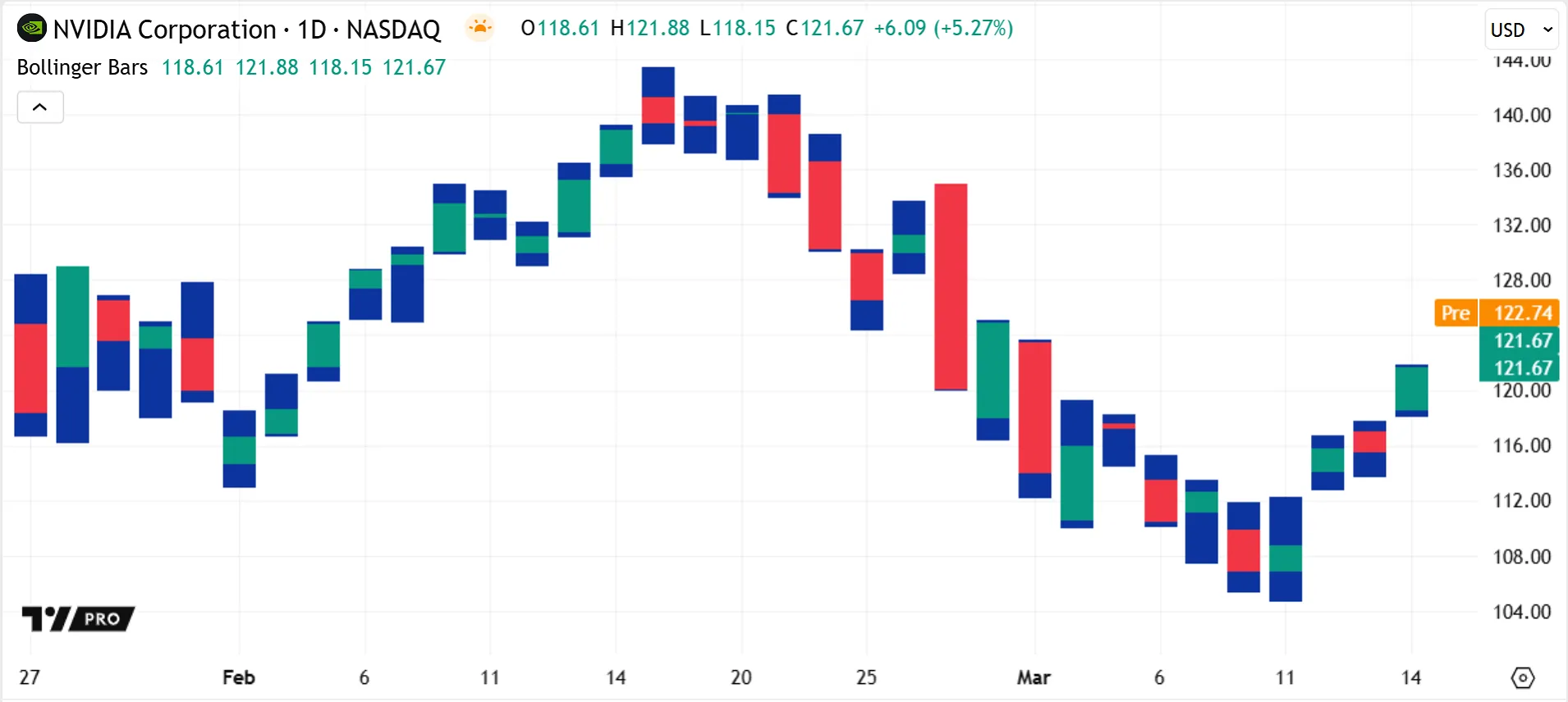
As with other plot visuals, the plotbar() and plotcandle() outputs can display in other locations: their numeric results in the script’s status line and Data Window (four values per plot) and their latest close value on the price scale.
See the Bar plotting page for more information about these functions.
Horizontal levels
The hline() function creates a horizontal level across the script pane at a defined price. The horizontal level extends fully across the visible space of the chart in both directions.
Unlike other plot visuals, a horizontal level’s only output is the line drawn in the script pane; it does not display values in the status line, price scale, or Data Window.
This visual element is useful for displaying minimum or maximum prices, thresholds, or support and resistance levels. Many built-in indicators like RSI, CCI, and Stochastic use horizontal levels to represent fixed boundaries for oscillator plots. For example, in the RSI indicator, the horizontal levels are upper and lower bands that represent the oversold and overbought boundaries:
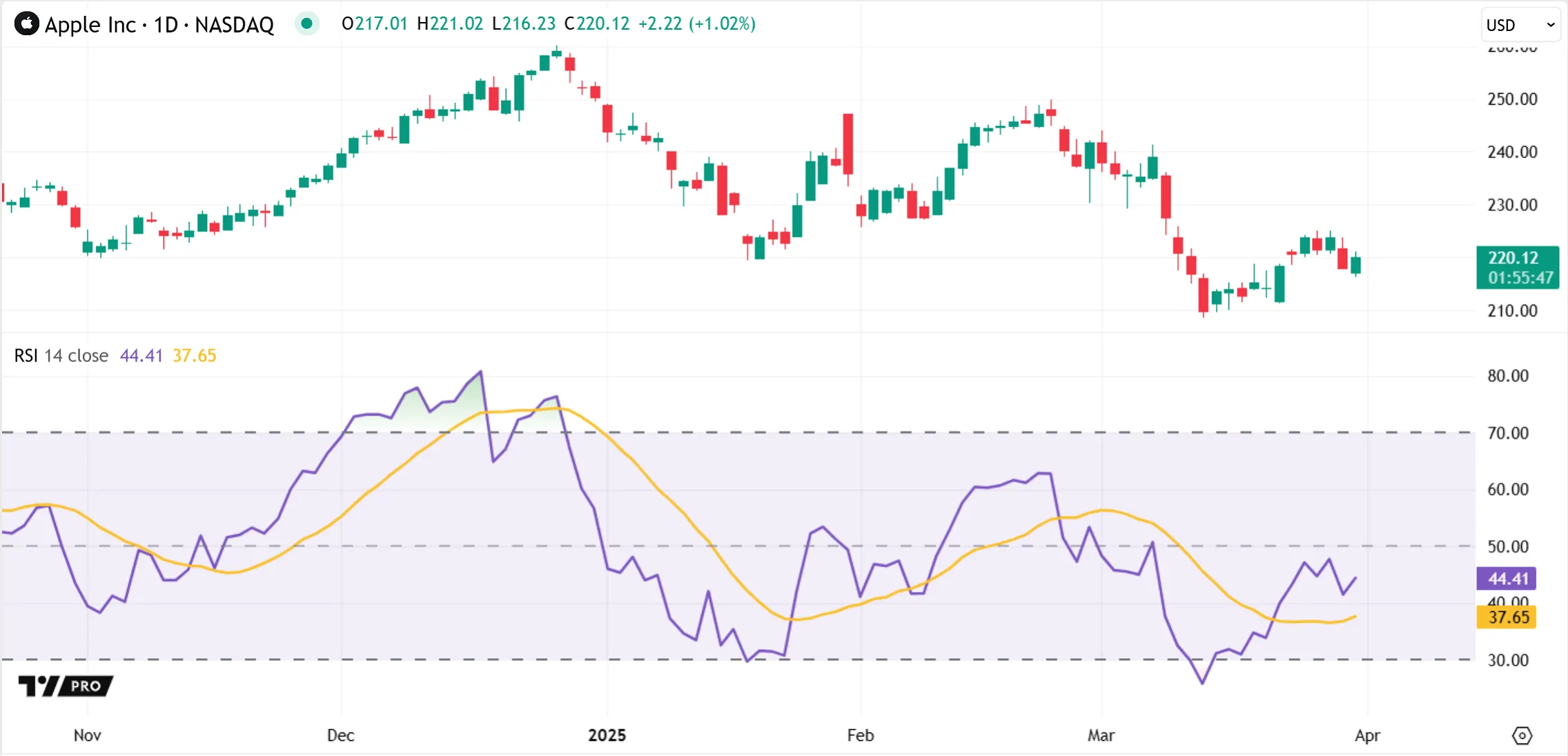
Some built-in indicators also use horizontal levels with fills to create colored bands, which can help to visually distinguish the typical value ranges from outlier ranges, as seen above.
A horizontal level uses a single, fixed price value, so it cannot use a dynamically-calculated value or a “series” type like close. Instead, scripts can use plot() to produce similar horizontal lines for dynamically-calculated levels.
Because an hline() call plots only a fixed level in a single color, it is often more performant than similar plot() lines. Adding a horizontal level does not count towards a script’s plot limit because the hline() function doesn’t create a plot series internally or externally to generate its visual output.
Background and bar coloring
The bgcolor() function sets the background color of the chart space behind a bar, while the barcolor() function sets the body color of a candle.
The functions accept both constant colors and dynamically-calculated colors, so they can use conditional coloring for bars or backgrounds. For instance, the built-in Moon Phases indicator uses bgcolor() to conditionally set the background color of the bars to highlight waxing and waning moon phases:
A bgcolor() call, like most visuals, affects the script pane by default. It sets the background color behind the main bar series only when it’s overlayed in the main pane — when overlay = true for the script or force_overlay = true for bgcolor() — otherwise it sets the background for the equivalent space in a separate pane.
By contrast, the barcolor() function always colors the main bar series in the main pane, even when called by a script executing in a separate pane.
As barcolor() only affects the main chart series, scripts cannot use it to alter the colors of new bars or candles created using plotbar() or plotcandle().
This simple example uses arbitrary bar_index and price conditions to set conditional background and bar colors:
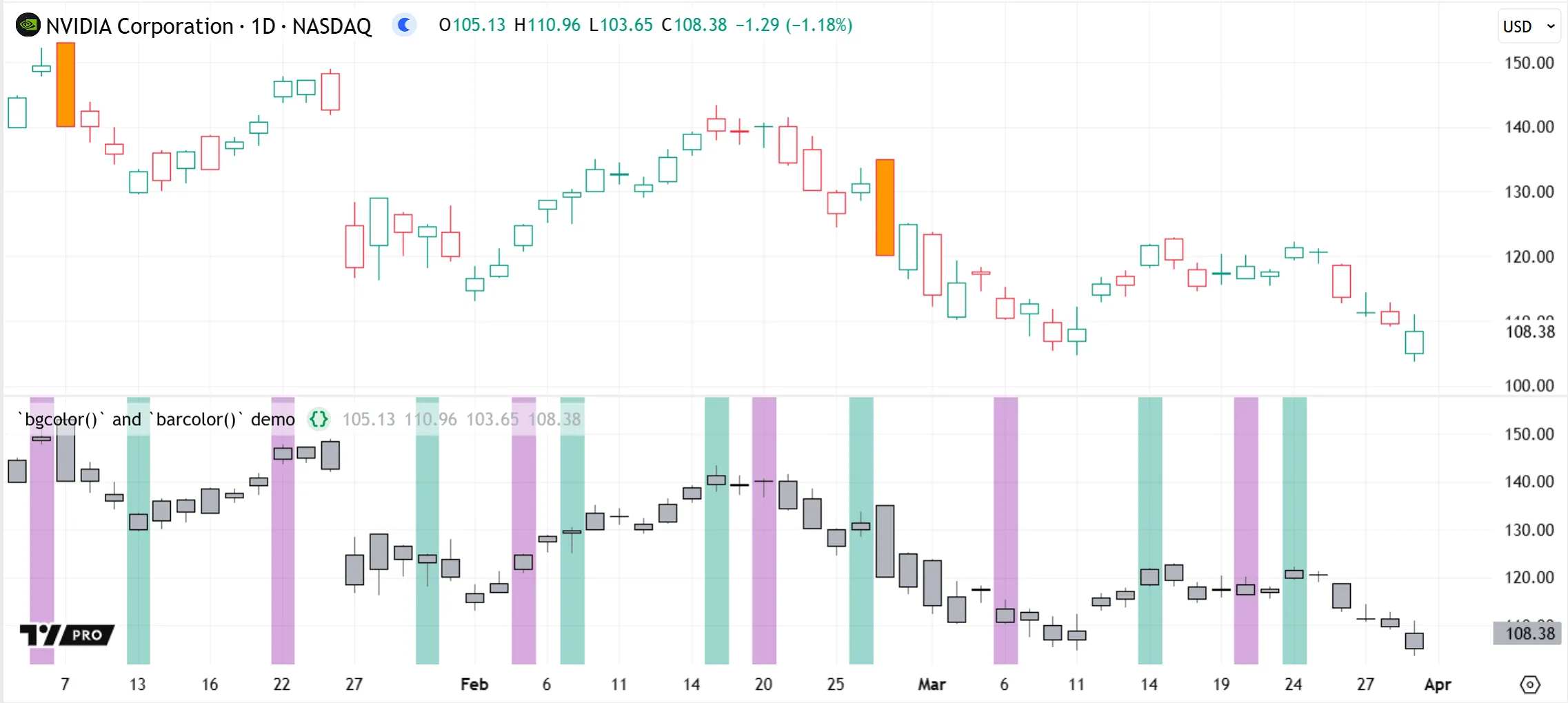
Note that:
- The script executes in a separate pane, but the barcolor() function colors the main series.
- The barcolor() call does not affect the new candles plotted in the script pane.
Fills
Scripts can use fills to set the background color of the space between a pair of plots or horizontal levels. The fill() function accepts both constant and dynamically-calculated colors. There is also a fill() function overload that can create color gradient fills.
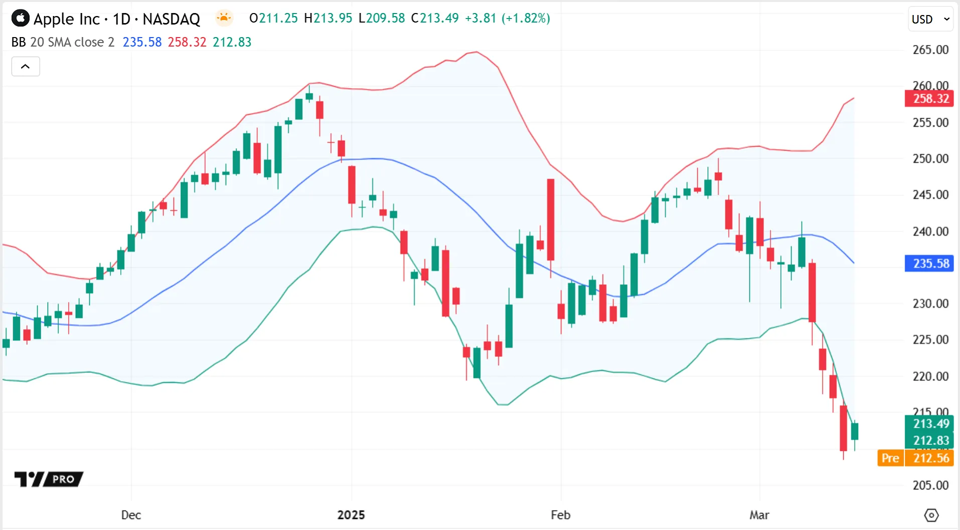
Fills between plots are commonly used in built-in indicators to visualize calculated channels or bands, like those used in the Bollinger Bands indicator, which signify the upper and lower standard deviations from its SMA line:
Fills between horizontal levels are often used in built-in oscillators to highlight chart regions of interest or to differentiate between typical and outlier ranges. For example, the Stochastic Momentum Index (SMI) indicator fills the background between horizontal levels that signify overbought and oversold boundaries, which can help easily identify signs of bullish or bearish trends beyond the filled regions:
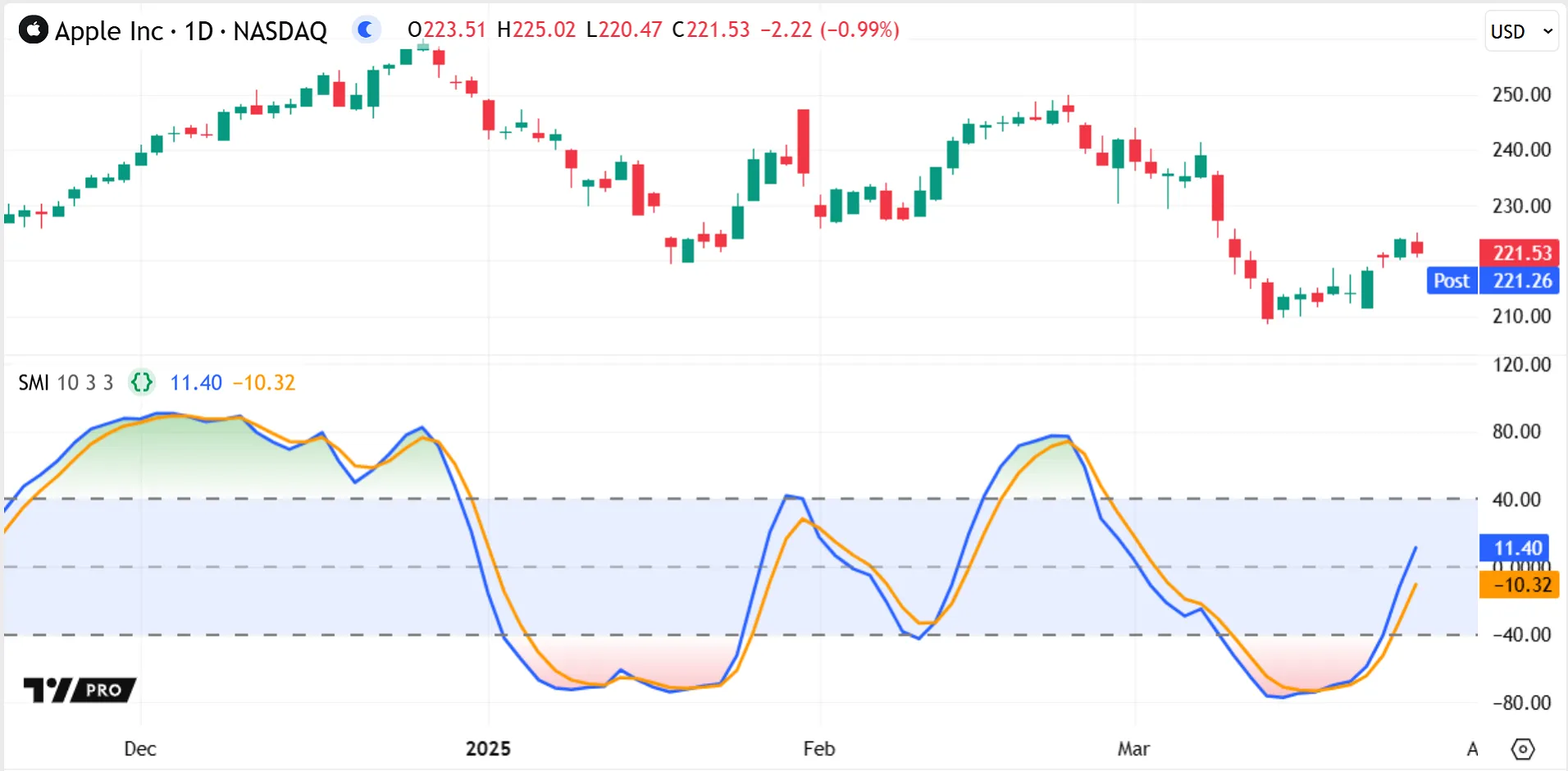
The SMI indicator also uses the fill() function’s color gradient overload to gradually color the space within the plot lines green or red as they enter the overbought or oversold zones respectively.
Other Pine visuals have their own dedicated fills, like linefills for setting the fill color between two lines, and built-in fill color arguments for drawing objects like boxes and polylines. See the Fills page for more information about the different fill mechanisms available.
Lines and polylines
Scripts can draw lines to visually connect any two points on the chart horizontally, vertically, or diagonally.
Like other drawing visuals, lines are independent from the main series, so scripts can draw them at any available chart locations from any bar.
Programmers can specify a line’s start and end coordinates using any of the following:
- A bar_index x-coordinate and price y-coordinate.
- A UNIX timestamp x-coordinate and price y-coordinate.
- A chart point object, where the x-coordinate is a bar index or time value.
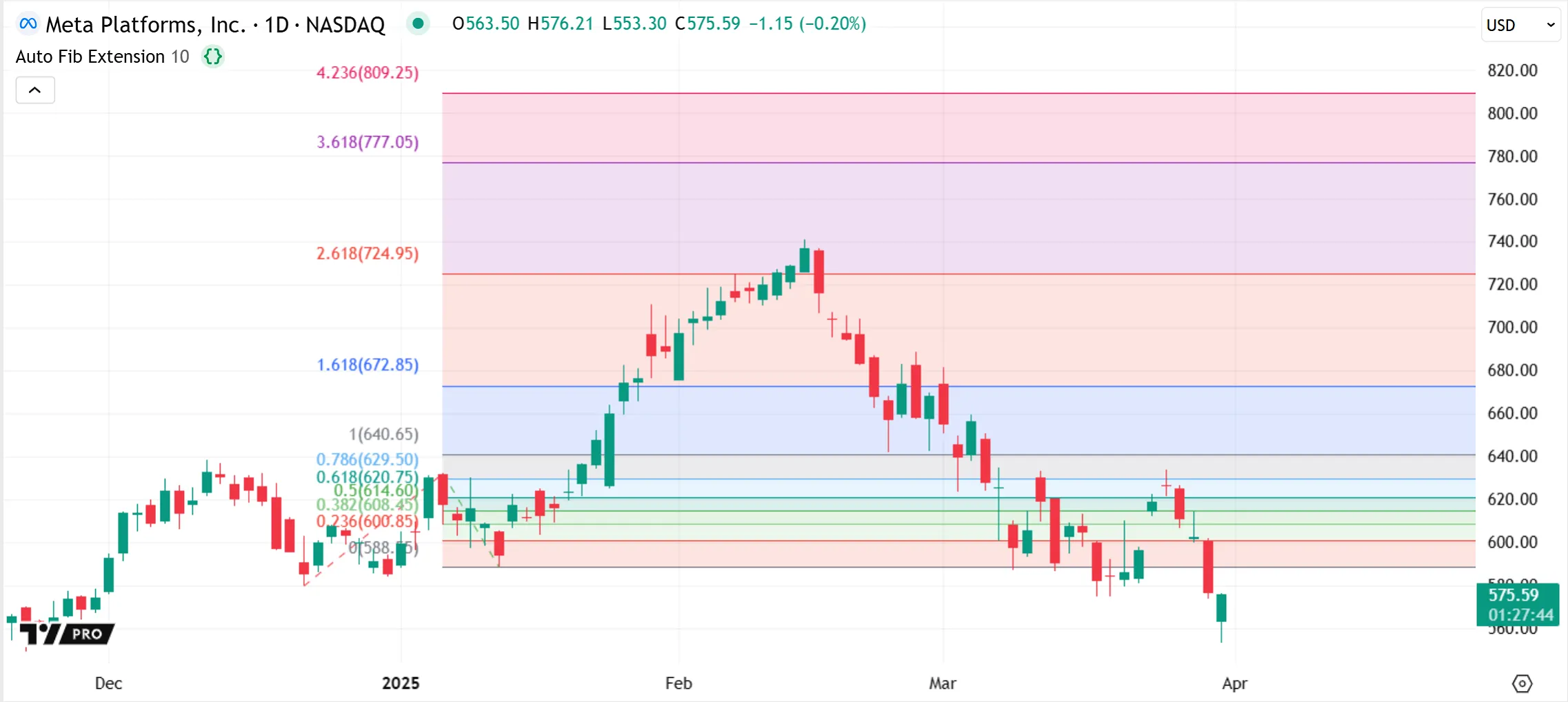
Lines can also extend to the left or right of the chart, like those used in the built-in Auto Fib Extension indicator to visualize projected price levels:
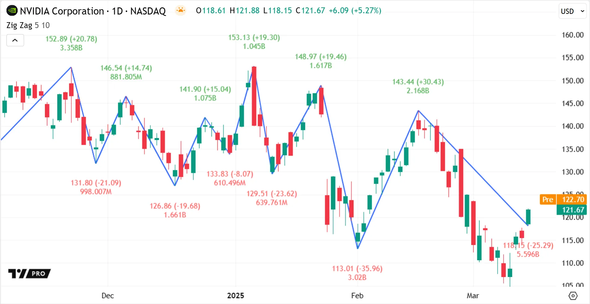
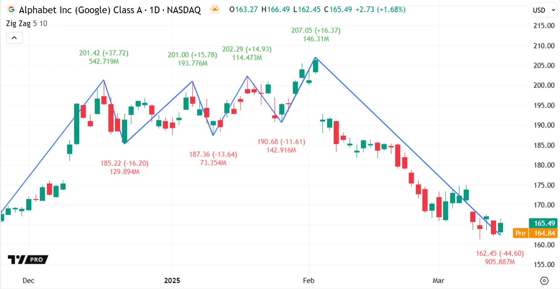
Scripts can specify line coordinates at dynamic offsets from the bars on which they’re calculated, to draw lines at varying lengths and distances. For instance, the built-in Zig Zag indicator draws straight, angled lines to connect calculated high and low pivots alternatingly across the chart, connecting the last leg to the last available bar. The indicator confirms a point as a high/low pivot only when the price reverses by a specified percentage over time. Therefore, it always draws its lines into the past from a different bar than that of the pivot point, and the number of bars between two sequential pivots is not predictable or consistent:
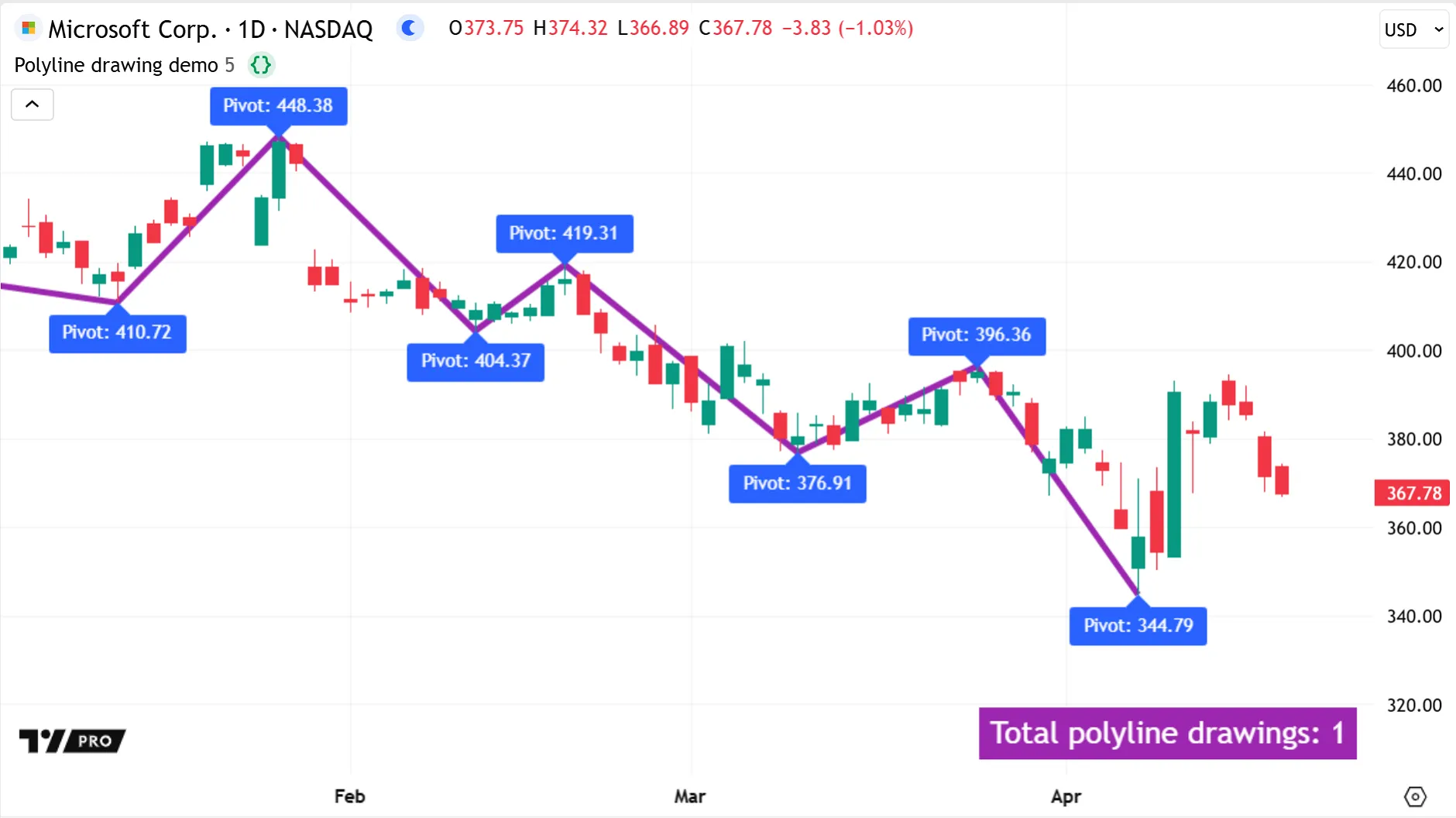
While a line object can connect only two points with a straight line, a polyline can connect multiple points on the chart consecutively to create a straight or curved line drawing. A polyline uses an array of chart points to set the coordinates of its sequential line segments, which can contain up to 10,000 chart points.
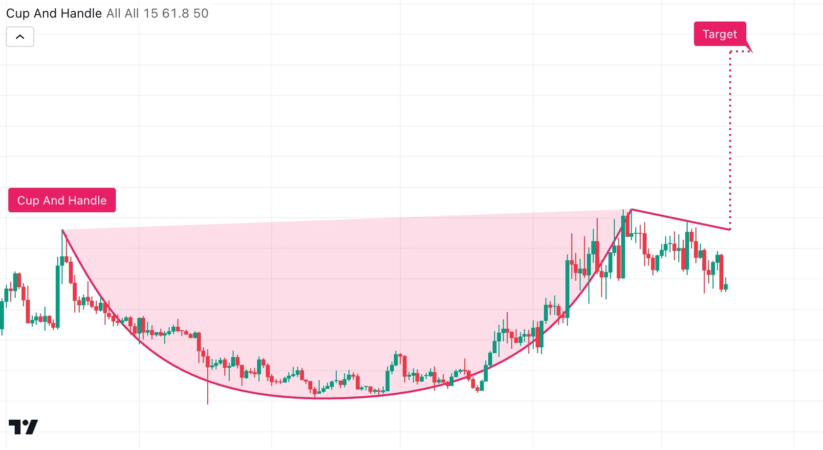
Polylines can create more complex graphic formations than lines or boxes. A script can connect chart points together with closed polylines to draw polygons, or leave them open-ended to draw geometric series across the chart. Scripts can also use open-ended, curved polylines to draw chart patterns like the Cup and Handle pattern, which identifies a U-shape price trend that is difficult to produce with other drawing visuals:
A script can replicate the visuals made by drawing several sequential line objects with just one polyline object instead. Using polylines can thus help a script to stay under the limits for the total number of lines.
For example, we can use a simplified version of the Zig Zag indicator’s logic to illustrate this. Here, we use one polyline drawing to connect pivot points across the chart. The script stores the high and low pivots together in one chart.point array, and creates the polyline object only on the last confirmed historical bar, using barstate.islastconfirmedhistory, drawing it retrospectively across the chart:
Note that:
- To avoid runtime errors due to the polyline trying to draw points more than approximately 9999 bars back from the current bar, one alternative is to use chart.point.from_time() to set x-coordinates with UNIX timestamps. Here, we instead use a loop to remove chart.point objects that are too far from the current bar, before drawing the polyline. Note that to accurately remove more than one element from an array using a loop, scripts must iterate backwards through the array.
- A polyline’s
curvedparameter accepts a “series” argument, so scripts can use Boolean inputs likeisCurvedPolylinein our example to easily switch between straight or curved line drawings from an indicator’s settings.
Scripts can fill the closed space of a polyline drawing using the polyline.new() function’s fill_color parameter. To fill the space between two lines with a specified color, use linefill objects, which are described in the next section.
Linefills
A linefill is a drawing object, unlike the fills for plots and horizontal levels. Calling the linefill.new() function instantiates an object of type “linefill”. Scripts can store linefill objects and manipulate them with functions, e.g., to set the associated fill color or retrieve the pair of lines.
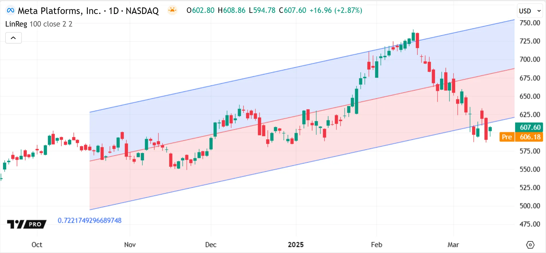
Similar to plot fills, linefills are useful for highlighting regions of interest, like calculated channels or trend zones, between two lines on the chart. For example, the built-in Linear Regression indicator uses two linefills between its baseline and its support and resistance lines, which signify the expected price movement ranges. Highlighting the upper and lower channels can make it easier to visually register the price reversal signals:
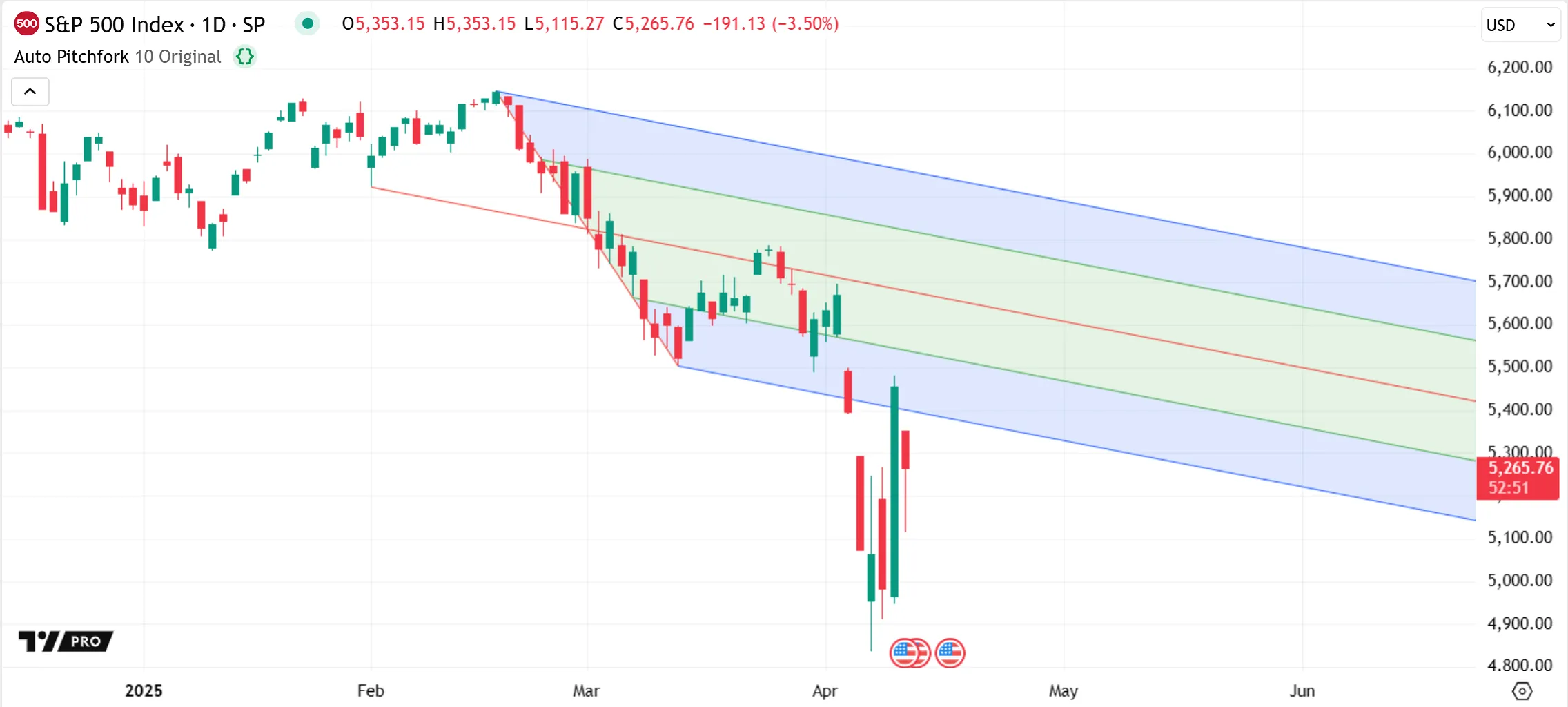
The exact dimensions occupied by a linefill object are defined by the pair of lines it’s attached to. Moving one line farther away, for example, automatically widens the attached linefill. Only one linefill instance can exist between a pair of lines, and it covers only the common space between them. If a pair of lines both extend in the same direction, the linefill can also extend infinitely, as seen in the Auto Pitchfork indicator:
Linefills can fill the space only between two “line” objects. For polylines, the polyline.new() function has a fill_color parameter to fill the polyline drawing’s closed space.
Boxes
Scripts can use boxes to create custom rectangle drawings on the chart. Like other drawing visuals, a box is a flexible object type, not a series visual, so a script can draw multiple boxes on the same bar, and can set box coordinates at any allowed chart locations ahead or behind the current bar.
Programmers can specify box coordinates using either two diagonal corner points or all four edges of the box, and can define the x-coordinates using bar_index or UNIX timestamp values.
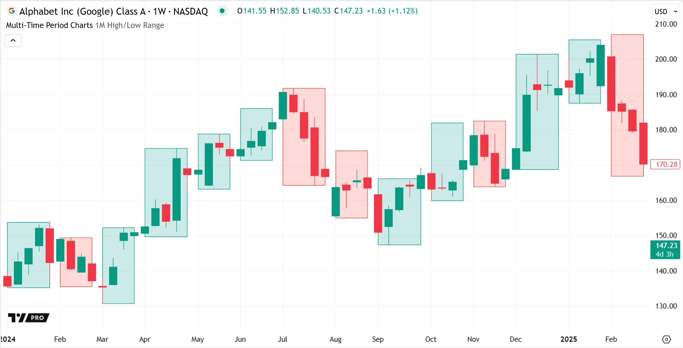
Boxes can be useful for highlighting chart areas of interest, showing price ranges, or visually grouping bars. For example, the built-in Multi-time period charts indicator overlays boxes on the current chart to visualize the corresponding higher timeframe candles:
Boxes can also display text as part of their drawings, as shown in the Seasonality indicator below. Scripts can customize a box’s text formatting, alignment, and wrapping, with auto-scaling and auto-wrapping options available to design boxes that are responsive to a user’s chart adjustments:
Labels
Labels are drawing objects that can display dynamic text on the chart. They accept “series string” arguments, so they can use changeable text values that aren’t known at the start of execution, like inputs or conditionally-calculated expressions, unlike the text displayed by `plotshape()` and `plotchar()`.
Scripts can manage labels in local scopes and draw them at historical or future positions, like other drawing visuals. Each label’s position is anchored to the chart’s x and y scales at a specific price and bar/time value. However, this position is flexible, as a script can modify a label’s coordinates any number of times.
In the built-in Zig Zag indicator, text labels display the calculated pivot prices and, depending on the selected inputs, can also display the reversal price and cumulative volume data within these same labels. The indicator takes advantage of several dynamic label features when building the concatenated label text and setting each label’s high/low position, color, and variable offset:
Many label.style_* options are available to customize a label’s visual appearance, including standard pointing labels and shape-based labels like crosses, triangles, arrows, or flags. The indicator above uses the label.style_none style to display the text on the chart without a visible label shape or outline. See the table in the positioning labels section of the Text and shapes page for all available label styles.
The versatility of labels also makes them particularly useful for debugging scripts. A label can easily show calculated numeric values, strings, or test conditions directly on the chart with little extra code. Scripts can even display empty labels without text to create quick visual markers, for example, to verify that conditions occur on their expected bars.
Tables
Tables are special drawing objects useful for displaying customized, organized information that isn’t connected to the chart’s price or bar scales.
Tables are anchored to the pane space itself, not to any x or y chart coordinates. As such, they remain fixed in size and position when zooming into or scrolling across the chart, even if they are overlayed in the main pane. Like other drawing visuals, tables do not change the data they display when the user hovers over different bars.
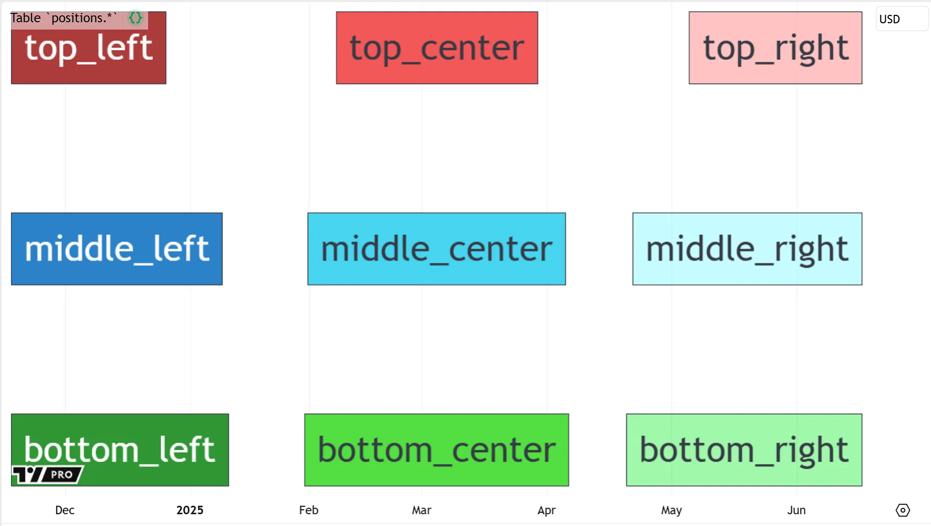
Scripts can draw tables in one of nine fixed pane positions, specified by the top, middle, or bottom vertical region of the pane and the corresponding left, center, or right horizontal region:
If a script displays more than one table in the same location, the table that is drawn latest in the code replaces any previous tables.
Similar to other drawings, tables have various features that scripts can modify during execution using setter functions. These include table-specific features like the frame, border, and height/width in the pane, as well as cell-specific features like background color, alignment, and text formatting.
A customization feature unique to tables is that, within the same table object, each cell can have different visual properties.
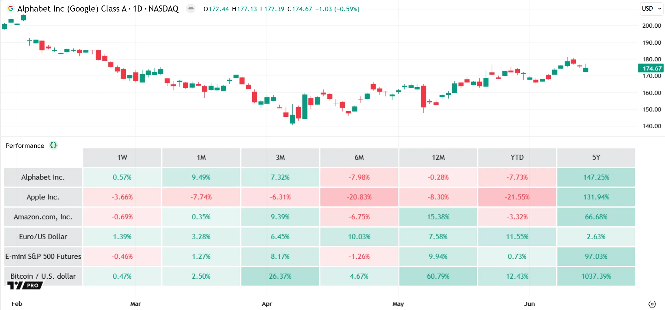
For example, the built-in Performance indicator shows the price percentage change at multiple timeframes for a group of symbols. It uses a variable color intensity for the cell background colors to represent each value’s absolute strength. The tabular format and dynamic cell colors make it easy to compare values across symbols and timeframes at a glance:
Unlike for lines, boxes, and labels, scripts cannot use getter functions to retrieve properties for tables drawn on the chart. To refer to an attribute of a table later in a script, first store the value in a separate variable.
The Performance indicator above draws its table only once during initial execution, on the last bar. This improves script performance and is recommended because a table only displays its last state. Tables are thus useful for displaying annotations or general information that won’t change during execution, like selected settings, release notes, misconfigurations, etc.
The following example script displays labels for the start and end of each daily trading session. As such, it supports only intraday data and does not display any labels on a “1D” timeframe or higher. The script displays a single-cell table if timeframe.isdwm is true, to notify users of this information:
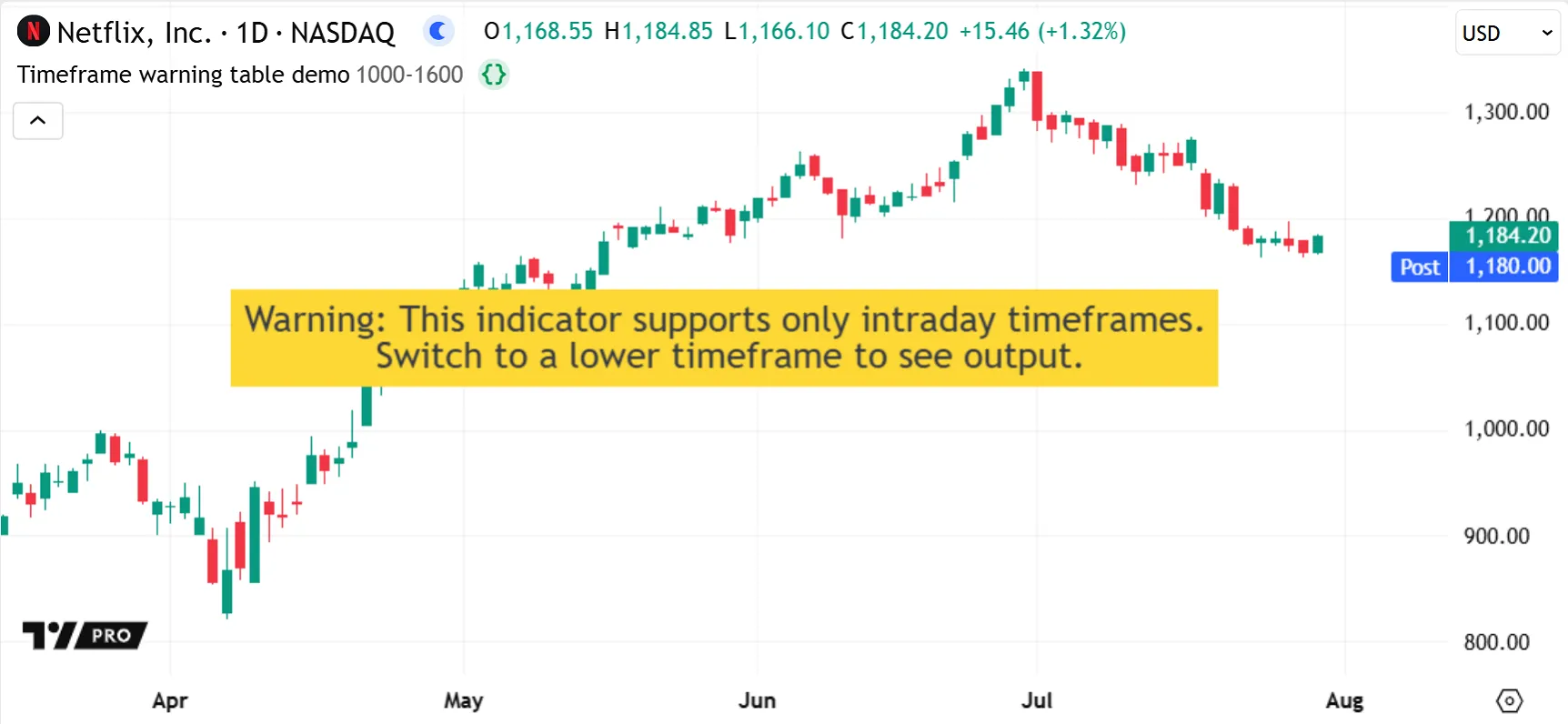
Note that:
- Using a table in this case ensures that users clearly see the warning, because it appears directly in the chart pane regardless of how their chart is scaled.
Lastly, a table’s organized format and fixed pane positions also makes it useful for debugging scripts. See the Tables section of the Debugging page for more details.